Responsive Redesign
Through this assignment, my goal was to practice the workflow of redesigning a simple website. I practiced the skills necessary to analyze and identify flaws in an existing interface, create low-fidelity and high-fidelity prototypes for various screen sizes, and build a responsive website based on those prototypes.
Identifying Usability Problems
Picking a Web Page
After moving to college, there wasn't a ton I missed from my home town. Of course, I miss my family and friends, but I also found myself missing Franco's Panzarottis. Calzones, while similar, simply do not satisfy the same itch.
After looking at the website for Franco's Place, a Panzarotti shop in my home town, I noticed that it could probably benefit from a redesign.
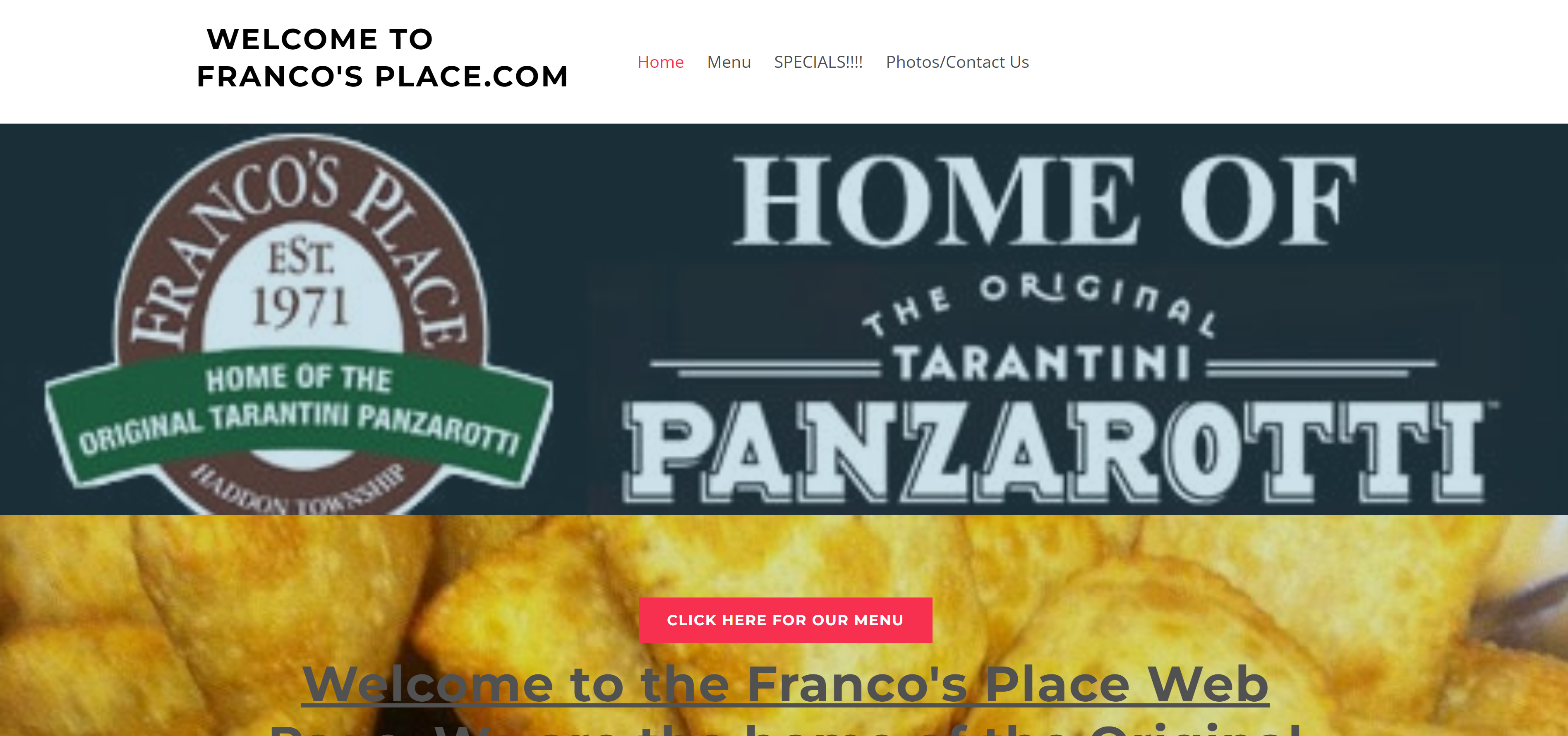
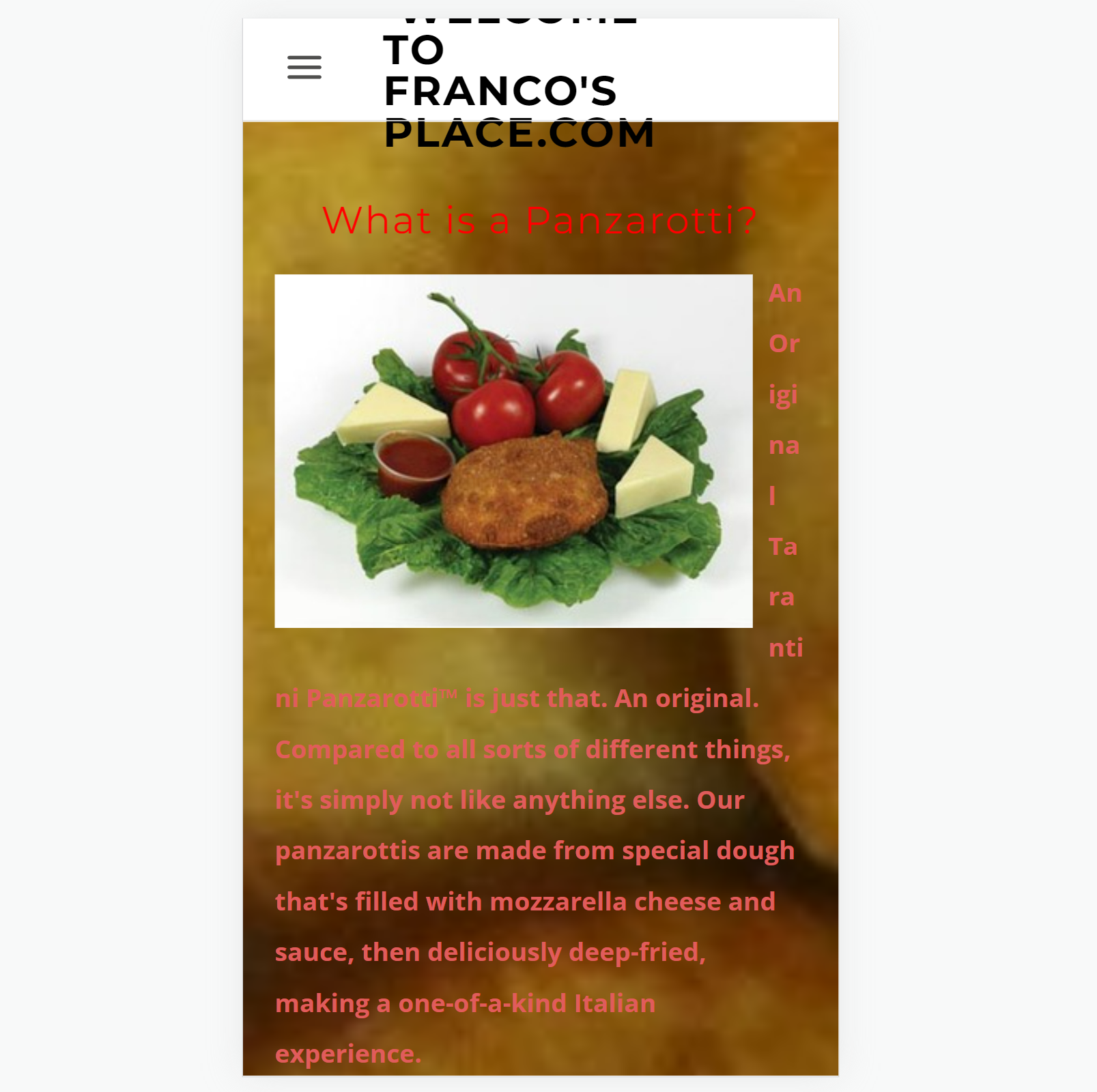
Looking at the site on my phone revealed an even bigger need for a redesign!
Finding Problems
In order to concretely define the usability problems with the site, I used three categories of criteria. From there, I used Jakob Nielson's 10 usability heuristics to further identify issues with the page.
- Usability
- The main content of the page is obscured by the large image at the top of the page
- The page title (in the navigation bar) is in all caps and has lots of text, which makes it hard to read and formats poorly on smaller screens.
- The title text is very long and conveys information that is available elsewhere on the page.
- Efficiency
- There are two buttons for the menu, one in the navigation bar and one in the main content.
- These two menu buttons have different textual content, but lead to the same site.
- The critical contact information is at the bottom of the page, which is below information on what a panzarotti is. Users will likely need to reference this contact info more than once, but will not need to read the explanation more than once.
- Learnability
- The text of the main content is difficult to read due to the busy background image.
- The navigation bar text has an inconsistent font format (capitalization and slashes).
- Some text on the page is underlined, but is not a link, which can be confusing.
- The logo and banner are at bottom of the page, which conveys no new information that far into the page and would be better for branding as the first thing you see. By the time you scroll down on the page, the logo is unnecessary since you will already know what page you are on.
Accessibility
Using the WebAIM WAVE tool for web accessibility evaulation, I found some accessibility issues with the original webpage.
Enumerated here are some accessibility problems I detected:
- Alt text for all of the images is just "*Picture*" instead of descriptive text
- The main content text has many contrast errors and the background image makes text hard to read
- There is no
h1element and all of theh2elements are used differently - Some links have bad descriptive text (such as "click here")
- Information is conveyed through images with no alt text, including via background images
- The navigation bar is an unordered list instead of the semantic
navelement - There is no link to skip to the main content.
- When displaying the page in Arabic, the phone number display the wrong orientation.
In my redesign, I sought to fix these accessibility issues as well.
Visual Redesign
Based on the previously identified problems, I have redesigned the website of Franco's Place.
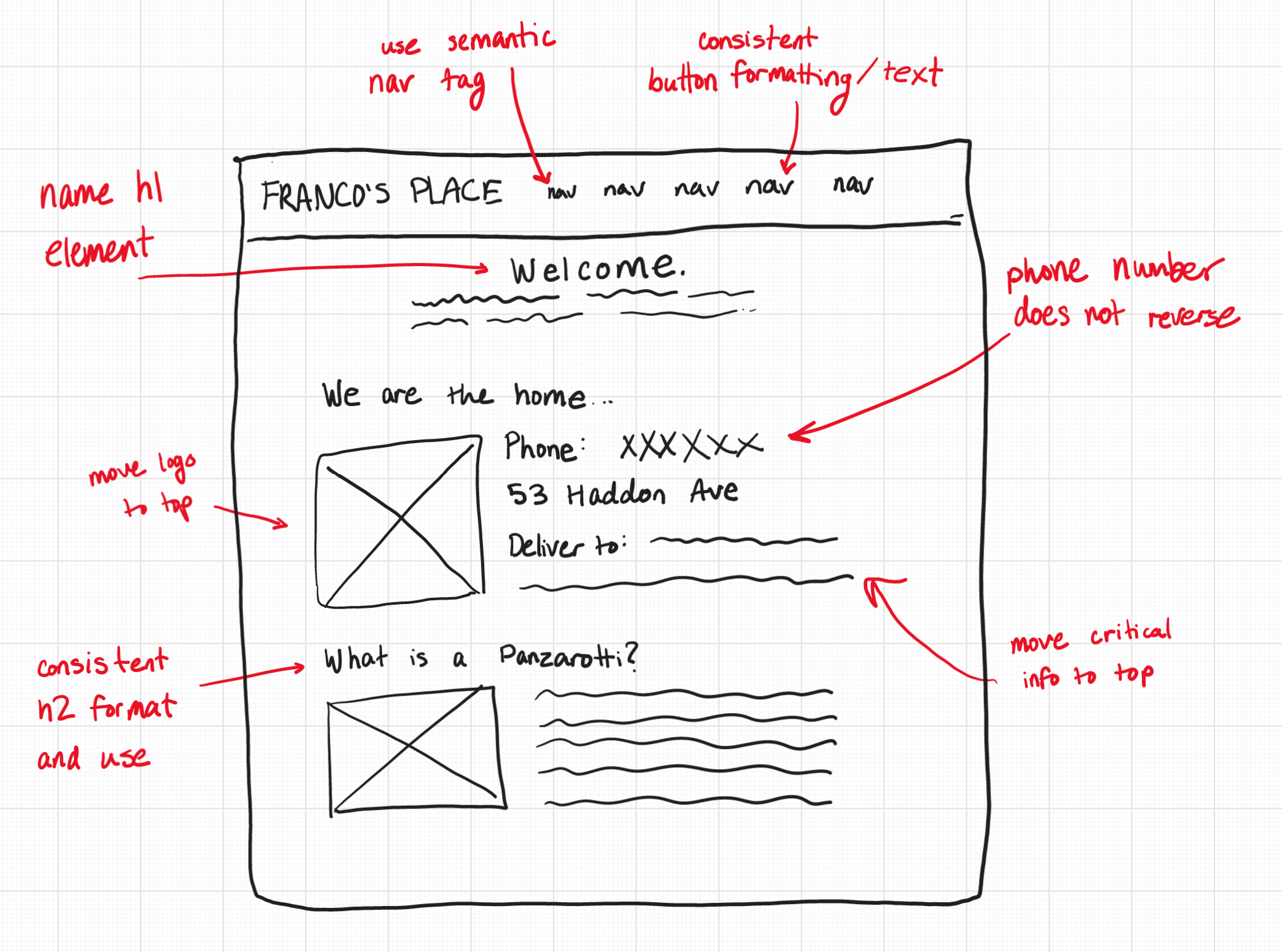
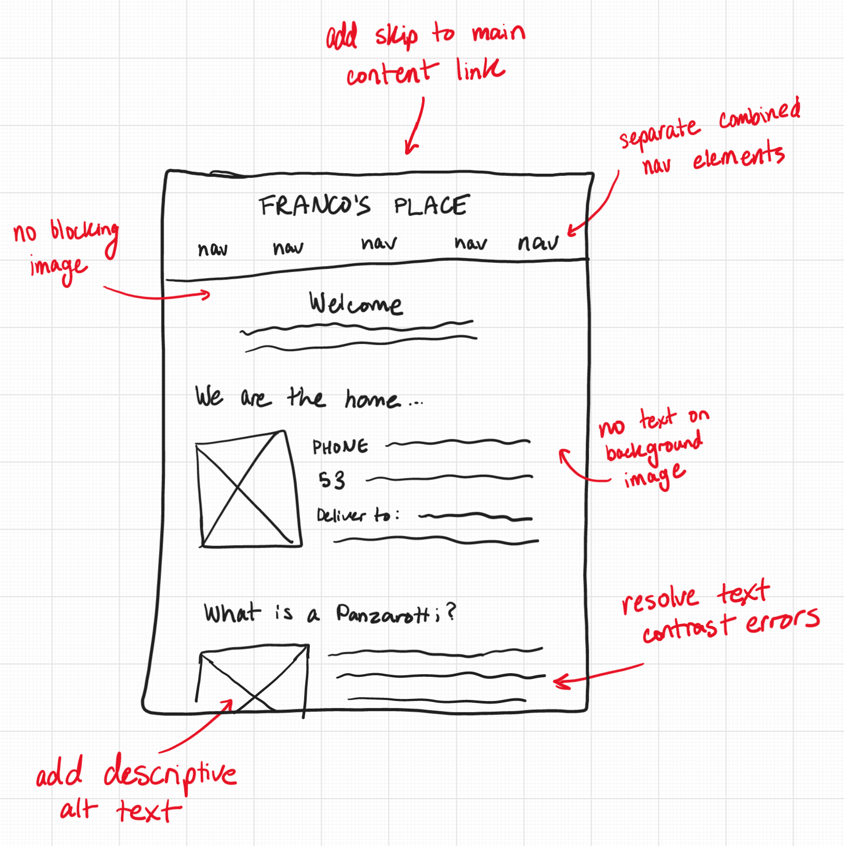
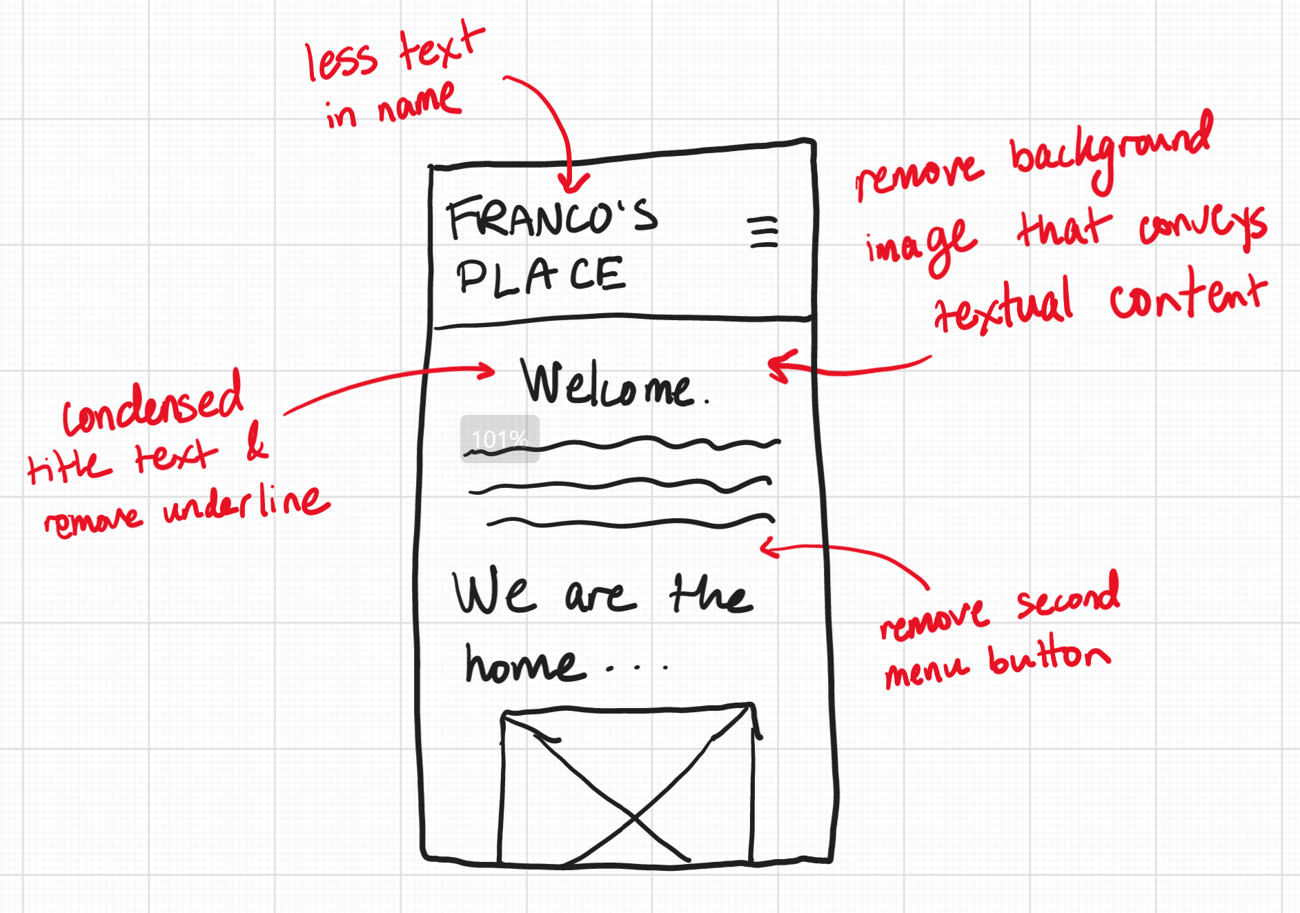
Low-fidelity Wireframing
To start with the redesign, I sketched a few wireframes for three screen sizes: mobile, tablet, and desktop. The design remains similar, yet responsive for each screen size. Annotated on each image is how I addressed the usability and accessibility problems with the new design.
Visual Design Style Guide
Before making any high-fidelity prototypes, I wanted to decide the style of the redesigned page by making a style guide.
In this guide, I show the main colors, typography, and components of the page.
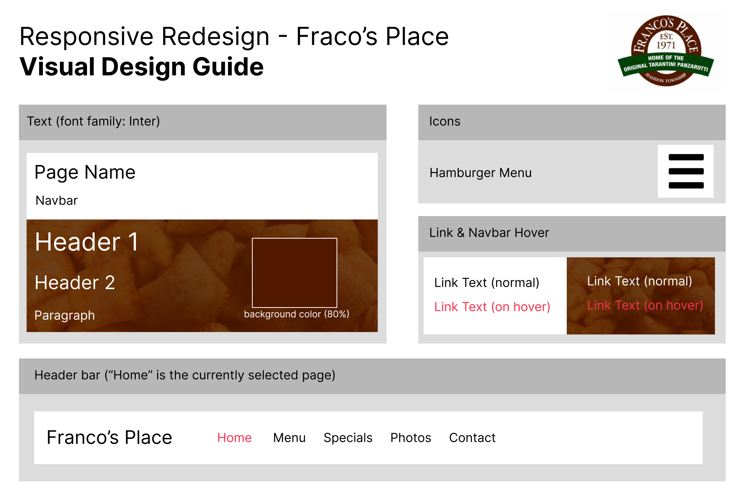
This guide shows the expected style of visual elements on the page. Base states and interaction states (such as hovering over a link) are annotated alongside the appropriate styles.
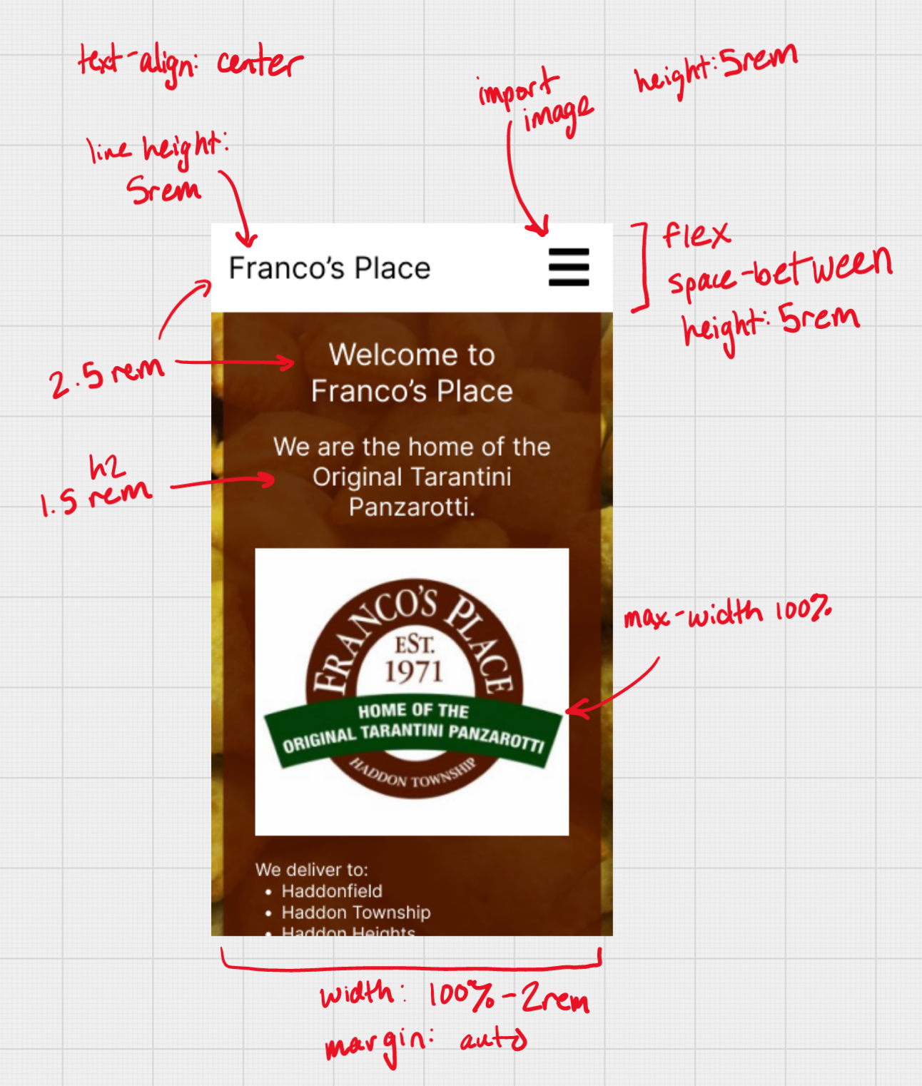
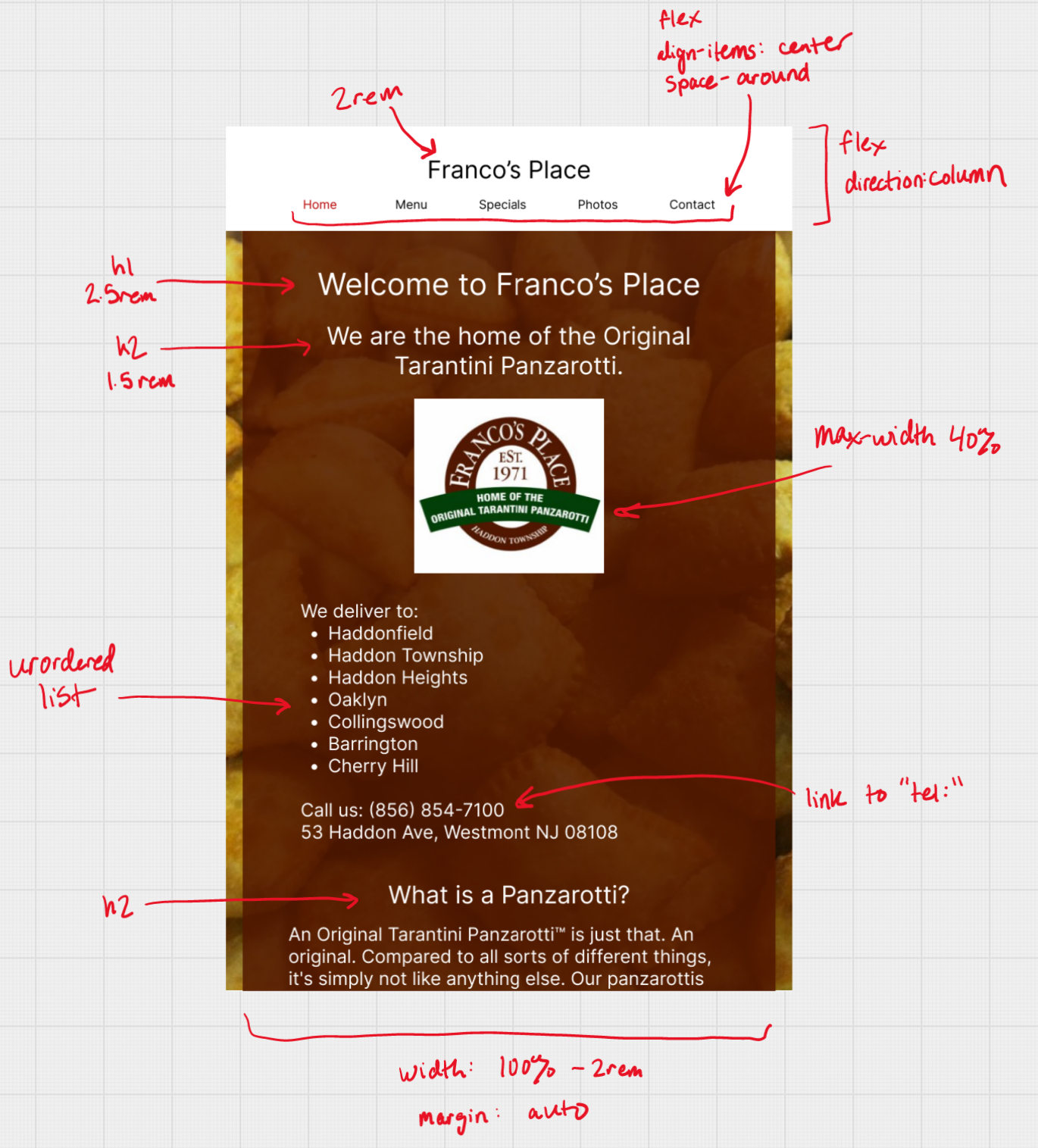
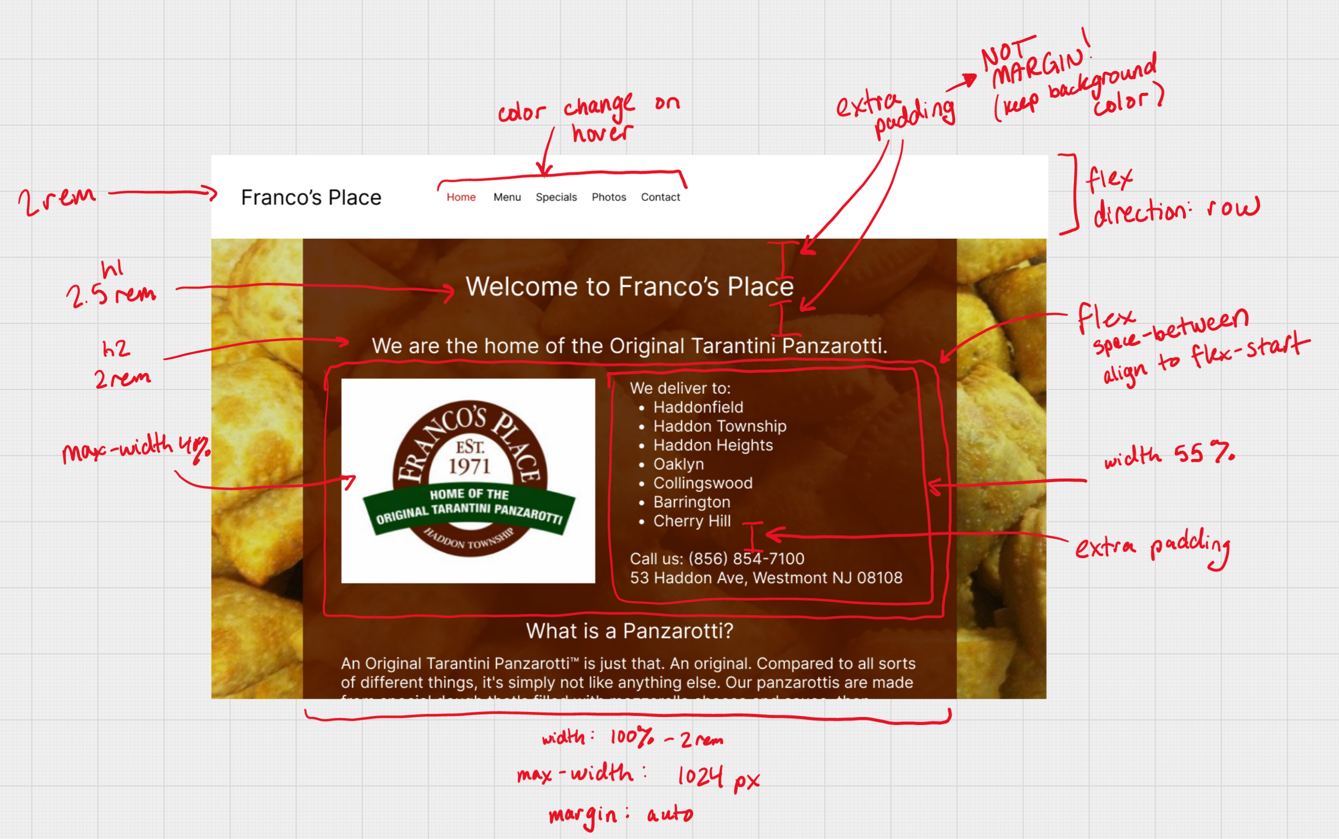
High-fidelity Prototyping
To finish up designing, I used my visual design style guide to build some higi-fidelity mockups of what the wite will look like.
Here, I have designed three prototypes in Figma for three different screen sizes. Each is annotated with the key styling components, including flex boxes and how links change on hover.
Due to the responsive measurements of elements, the in-between dimensions between these prototypes should look similar.
Since I employed a mobile-first design paradigm, Any changes expressed in the smaller screens is also continued in the larger screens, unless overridden.
Responsive Redesign
Using the final high-fidelity prototypes, I then created the page using HTML and CSS. Navigational elements do not actually redirect, and other dynamic elements are recreated visually, but are not yet interactive.
Here, you can view the redesigned Franco's Place site. Try resizing to see the responsive elements!
Additionally, try changing the font size or translating the page with Google Translate (here's the responsive page translated to Arabic!)